You have phones right?
A new day a new update. This time we’ve got some changes to mobile website, as well as improvements to documentation and organization in the frontend! Let’s get right into it

Navigation
I’m trying out a new logo. Let me know what you think!
You can now click on the MCCreations name to go home!
There’s a new alpha badge to make it obvious the site is not done
The navigation bar will now follow you around on the site! It’s stiiicky
The navbar will now compress into a menu on mobile!

Slideshows
Cards are now much bigger on mobile

They’ll also animate a little on page load so you know you can scroll them!
I’ve expanded the touch target to the full width of the card rather than just the width of the title
Map Pages
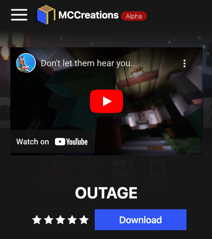
The download, title and video/logo section has been updated to fit on mobile!

The information sidebar has been moved to the bottom of the description
Search and Filters
Filters are here! The options are pretty limited for now, but more will be coming soon as well as improvements to the existing ones (especially version I know that thing is a pain)

Improved Documentation
Since moving to Typescript, I’ve tried to clean up some functions and documentation for the data fetching in the front end. Functions should now all be in the same place, getData.ts and each has it’s parameters and return types documented. All objects returned by the API should now have respective interfaces in types.ts as well. Next steps on this front are to better componentize elements in the application so it’s more obvious what things are built from! Thank you for sticking with me as I work through this mess!
What’s Next?
For the next coming weeks I’ll be working on getting user accounts and creators added to the site. I want to make sure this is done well because, well, now I’m dealing with your actual info so you might not see updates for a bit. I have a pretty good plan for how I’m going to do this, so it might go faster but whoooo knows.

